
Accessibility in T4: dos and don'ts
Write your alt text in the image's 'description' field in the Media Library.
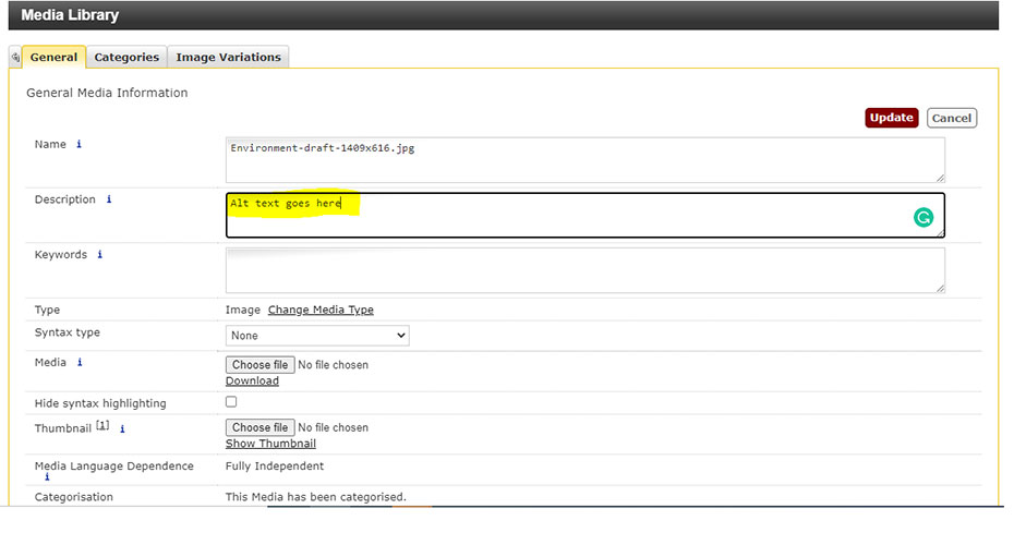
It's the second field from the top.
Do:
Use headings to break up text
- Headings show people the hierarchy of information on a page.
- Use heading 2 for the top-level categories on a page.
- Go down in size chronologically, i.e. Heading 2, then 3, then 4 – don’t skip from 2 to 4.
Write simple, short sentences and paragraphs
Writing feels longer when viewed on a laptop or phone than in a printed document.
- Aim for an average sentence length of around 15 to 20 words
- Make a single point per sentence.
- Write in active voice, e.g. ‘Steve ate the apple’ not ‘the apple was eaten by Steve’
- Use the simplest word that will convey what you need to, e.g. ‘help’, not ‘assist’
» Use the web style guide for help with writing for our website
» Check your language is clear and straightforward with the free Hemingway app.
Paste your content into T4 as plain text
Never copy and paste directly from a Word document or email. This pastes in formatting that will make your page look odd and stop people being able to make sense of it using assistive technologies.
There are 3 ways to paste as plain text:
- Use the keyboard shortcut Ctrl + Shift + V
- Click the ‘Paste as plain text’ button and then use Ctrl + V
- Paste your content into a Notepad file, then copy it again and paste it into T4 using Ctrl + V. This strips out any formatting. Here’s how to find Notepad on your computer.
Use descriptive link text
Good link text makes sense if you remove the rest of the sentence.
- e.g. 'The accessibility fundamentals page tells you about best practice'
- Not: 'Click here for accessibility best practice'
Always use the image and video templates
To add an image or video into your page, choose from these templates:
These are designed to be accessible. See the Responsive templates site for how they look on the page. Avoid using embed code or pasting in images.
Use lists
Use bullet points or numbered lists to make information easy to scan.
Provide alternative text for images
Alternative (alt) text stops visually impaired users missing out on information and helps them make sense of an image.
- Good alt text tells someone the content and function of an image. e.g. 'Graph showing the positive correlation between diet and muscle density'.
- Keep it as succinct as possible.
- You don't need to include the word 'image' in your alt text. A screen reader already knows it's an image from the code.
- Write your alt text in the Description field when you upload the image to the Media Library.
- If an image is just for decoration and doesn’t add any meaning to the page, you can leave this blank.
Don't:
Use images with text in them
- Text should not be used as part of an image unless it forms part of a logo. This is because it cannot be read by a screen reader.
- If an image does include any text then the text must be repeated in the alt text for that image.
- If you use an infographic, you must also provide a full transcription of it on the page.
Write out URLs in full
We sometimes do this in emails, but it should never be done on the web.
e.g. Instead of ‘Information about research can be found at: https://geography.exeter.ac.uk/'
Write: ‘The Geography website has information about research’ or ‘Information about research can be found on the Geography website’
Use italics or underlining
Italics can be difficult to read, and underlined text on the web looks like a link.
Use bold formatting instead of headings
Bold should be used to emphasise important information, not in place of headings.
Use ALL-CAPS for emphasis
Use bold formatting instead. This is easier to read and will be understood by screen readers.
Use the same link text for multiple links on the same page
E.g. If you have a page with three links to campus tours, don’t use ‘campus tour’ as the link text for all three. Instead, use descriptive text such as:
This means people can tell what each link leads to, just by reading or listening to it.
Paste tables into T4
Always build them from scratch (this might take a bit longer initially, but will save you so much time spent fixing errors).
Use the return key to add space into a page
This can cause problems for screen readers and make your page rank lower in Google results.
If you want to break up a page or distinguish one section from another, why not use a highlight content panel? Here’s an example of a highlight content panel being used to break up a page.
Use tables to lay out a page
Never use tables for anything other than displaying information.
Instead you can use accordions, tabs, feature boxes, highlight content panels, and www page templates to design your page. The advanced training videos demo how to use these templates. If you’d like some advice on how to lay out a page, please contact us: digitalteam@exeter.ac.uk
Paste as plain text button
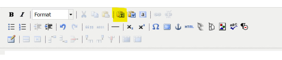
The Paste as plain text button is the 7th option from the left in the top row of T4's formatting toolbar.