30 years of web evolution at the University of Exeter
by Martin Williams, Web Systems Support Manager
I began working at the University of Exeter in December 1990 within the External Relations Division as a Clerical Assistant. Over time, my role evolved into that of a Desktop Publishing Operator, where I was responsible for producing printed materials such as posters, departmental fact files, and staff newsletters.
In 1995, the University launched its first official website, coinciding with the broader adoption of the internet and the World Wide Web across the higher education sector. At that early stage, a colleague in the Computer Unit developed a text-heavy version of the site. Due to the limitations of internet speeds - whether accessed via network or dial-up modem - images were used sparingly, as file sizes and download times were significant considerations.
Following a departmental merger, we became the External Relations and Development Division. As digital communication grew in importance, printed materials increasingly needed to be made available online to reach a broader audience. This shift marked the beginning of my journey into web development, and since then, I’ve been involved in seven major website redesign and restructure projects.
I’d like to take you on a journey through the dates below on each of these redesigns - highlighting how we approached updates at the time, the challenges we encountered, and how we overcame them.
1995
After the initial website launch, we saw an opportunity to publish key University publications online. This included content from the Undergraduate, Postgraduate, and PGCE prospectuses, as well as the University Calendar. To support this, our team brought in a part-time Computer Science student who developed a macro in Microsoft Word. This powerful tool allowed us to convert large documents - complete with headings and structured text - into HTML, the language used to build web pages.
At the same time, I began learning the basics of HTML using a tool called HTML Assistant Pro. While the macro handled much of the conversion, manual refinement was still needed to ensure the pages were clean and well-structured. This hands-on experience laid the foundation for my web skills and deepened my understanding of how content could be effectively adapted for the web.
I was then allocated a section of server storage and granted user permissions to upload HTML files, making them accessible online. At the time, this level of access felt like a real privilege - web publishing was still in its infancy, and only a handful of people across the University had the ability to publish content directly to the web.
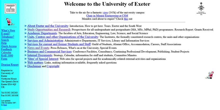
It’s a stark contrast to today’s more distributed and user-friendly publishing models. As the site evolved, we began adding press releases and event listings.
However, the website remained largely text-heavy, reflecting the limitations of early web design and the technologies available at the time.
2000
Fast forward to February 2000, the University made a pivotal decision to transfer editorial control and ownership of the website from the Computer Unit to our team in the External Relations and Development Division. This marked a significant shift in how the website was managed and developed.
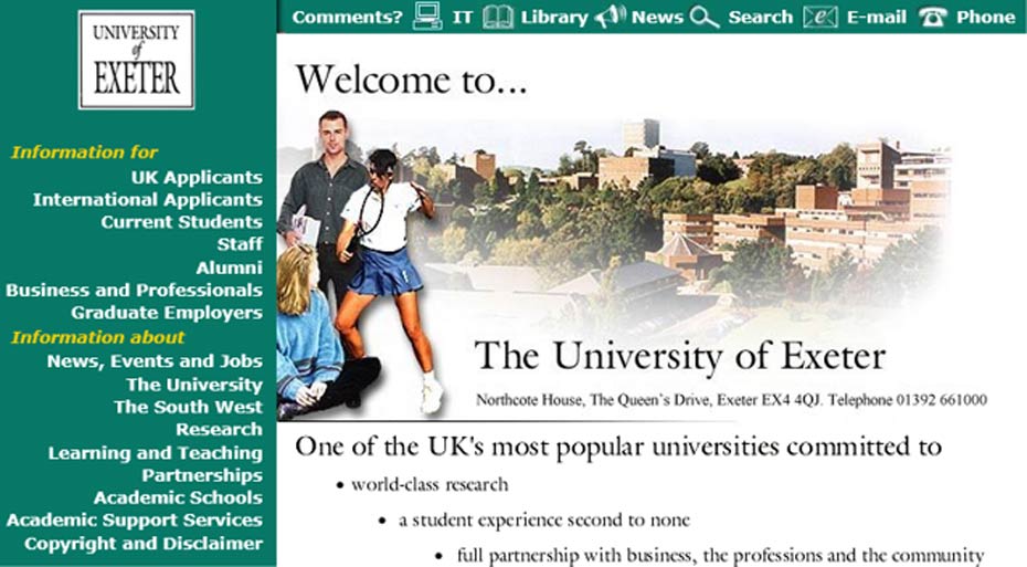
To support this transition, the University invited web design agencies from across the country to tender for a full redesign. A company called The Design Works was selected to lead the design process. When the new designs were delivered, the transformation was striking. For the first time, the website featured colour, imagery, and interactive elements - such as rollover effects on the left-hand navigation buttons that changed colour when hovered over. Compared to the previous, text-heavy version, this was a major leap forward in both design and user experience.
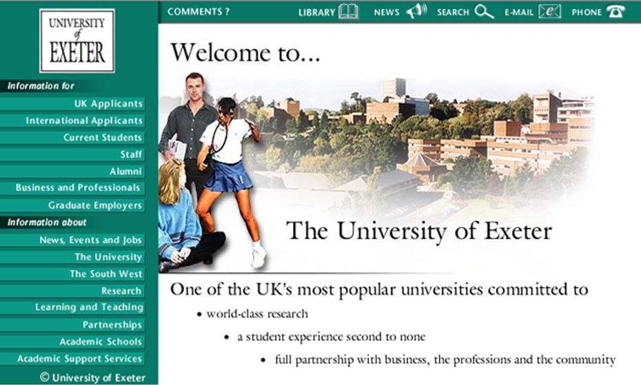
We were provided with HTML templates for each of the subpages shown in the new design. Each page included a decorative image, a banner, and a strapline graphic to maintain visual consistency across the site. I was responsible for creating at least 100 individual pages to implement the new design uniformly.
The process was entirely manual - I built each page using HTML Assistant Pro or Notepad, working directly with raw HTML code. To check my progress, I would preview the pages in a Netscape Navigator browser window. At the time, this was a meticulous but rewarding task, and it gave me a deep understanding of how websites were constructed from the ground up.
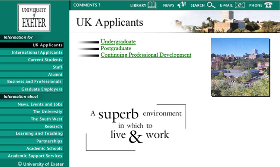
As the website matured, it became clear that we needed proper governance for managing homepage content and web page creation requests. This included handling submissions from departments wanting to claim space on the homepage, request new links, or propose new web pages or entire websites.
Around May 2001, IT Services requested a presence on the homepage. After much constructive discussion and persistent follow-up from their team, we decided not to go back to the design agency. Instead, I created a custom button for them from scratch - and, if I’m honest the outcome, didn’t look too bad!

At that time, I was the only person with access to the top-level pages, so any additions or changes had to be formally approved by the Head of Publications.
2002
The Web Content Accessibility Guidelines (WCAG) were first released in 1999, setting out legal requirements to improve web accessibility for people with disabilities. One of the key mandates was the use of ALT tags for images - providing descriptive text for screen readers unless the image was purely decorative, in which case an empty ALT tag was required.
By 2002, further updates to the guidelines prompted significant changes to our website. One major adjustment involved replacing our image-based rollover navigation buttons with text-based links, allowing users to resize text within their browsers. This change also required updates to our CSS (Cascading Style Sheets) to ensure that all on-page text could be resized for better readability and accessibility.
Implementing these changes was a substantial undertaking. Every page had to be rebuilt to comply with the new standards, but it was a necessary step toward making the website more inclusive and user-friendly.
By this point, I had trained around 30 web authors across the University to use FrontPage, helping to decentralize content management. However, we began facing challenges with consistency, as some users started creating their own websites using custom designs and simply adding the University logo anywhere on the page. This led to a fragmented and inconsistent web presence.
In 2003, we introduced a new feature on the homepage: a seasonal banner at the top to highlight key events. We also began adding hover-over links to external websites directly on the main image. While these additions brought more interactivity and visibility to featured content, they also made the homepage feel increasingly cluttered.

Also during 2003, the University appointed its first Web Editor, who assumed overall responsibility for the governance and strategic direction of the University website. This role was also part of a newly formed Web Steering Group, operating at a high committee level to guide digital development.
This marked the formal creation of the Web Team. Our small team - just three of us at the time - became responsible for managing the University’s homepage and providing advice and support to colleagues across the institution involved in web-related work. We held weekly editorial meetings to plan, review, and coordinate current and upcoming content for the site.
By May 2004, we launched a new website design using templates built using some software called Dreamweaver. This redesign brought a more structured and modern look to the homepage.
This 2004 design marked a significant step forward, as it allowed the website to become responsive. Unlike the previous two designs, which were fixed at 800 × 600 pixels, the new layout could adapt to wider screen resolutions - making better use of available screen space as monitor sizes increased.
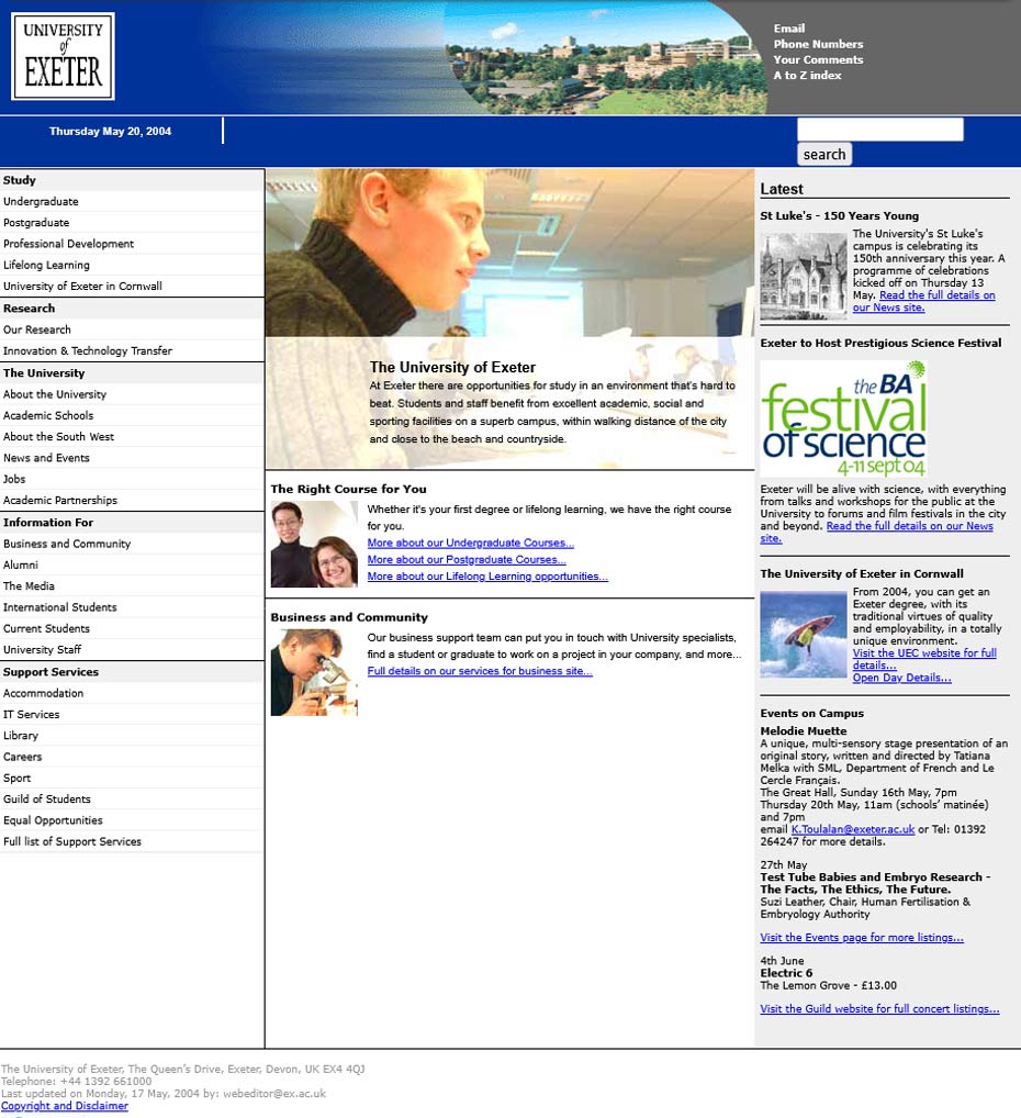
The redesign also enabled us to enhance the global navigation. We moved away from the previous “Information for” and “Information about” link groupings and introduced a more streamlined structure. The central area of the homepage was dedicated to highlighting key content and useful links, while a “Latest” column on the far right showcased recent news and upcoming events.
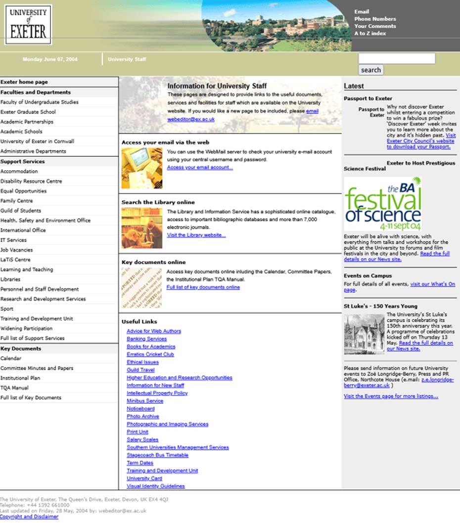
Second-level pages were colour-coded to distinguish different sections of the site. For example, the Staff homepage had its own unique colour scheme.
At this stage, the new design was still limited to the University’s central corporate web pages, while academic schools continued to use their own independently developed designs. To address this inconsistency, we developed a set of corporate web templates that colleagues could use to transition their sites into the new University design and structure. However, adopting these templates required web authors to purchase and license Dreamweaver software, which presented a barrier for some.
All Schools and Departments were strongly encouraged to adopt the corporate templates to improve consistency in appearance, structure, and standards across the University’s web presence. Despite this, there was some resistance to change, particularly from areas that had invested time in their own designs.
2005
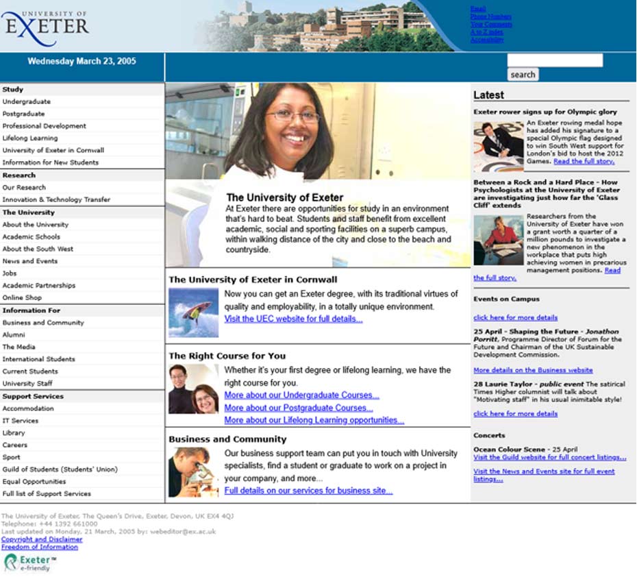
In March 2005, the University introduced a new visual identity, replacing the old boxed University of Exeter logo with a refreshed design - marking another step toward a more unified and modern digital presence.
With the introduction of the University’s new visual identity in 2005, we faced the significant task of updating every web page that used the old logo. For the corporate designs, we also introduced a new image of the University campus alongside the updated logo. At the same time, we revisited the page structure and made improvements to the CSS to enhance the user experience, particularly around screen resizing.
We also had to ask web authors managing school and department websites to update their sites with the new logo - a task that wasn’t always warmly received. However, by summer 2006, many academic schools had adopted the corporate design, and a large-scale rollout was underway.
As the number of pages on the central website grew, we encountered challenges with maintaining consistency. Any change to the left-hand navigation required editing the main Dreamweaver template for that section. To manage this, we implemented a check-in/check-out process to avoid overwriting each other’s work, as we were all working from a shared network drive. This process involved pulling files from the server, making template changes, and then pushing the updated files back.
To streamline navigation updates, I explored the use of Server Side Includes (SSI). By configuring templates to pull in a shared navigation file, we could update global navigation in one place without needing to modify every individual template - saving time and reducing errors.
As adoption of the corporate templates grew, we introduced colleagues to Adobe Contribute, a more accessible and cost-effective alternative to Dreamweaver. Users were provided with an electronic key and could log in with their credentials to edit only the editorial areas of their sites, while the structural elements remained locked down - ensuring consistency and control.
2008
In 2008, our team expanded with the appointment of a Web Designer and several Web Marketing Officers to meet growing demand. Around this time, we also put out a tender for a content management system. TerminalFour (T4), with its platform SiteManager, was selected.
To prepare for the transition, we conducted card-sorting exercises and engaged with user groups and a working group to shape the new website’s structure and information architecture. Using wireframes and feedback, we collaborated with T4, who provided training on building templates and using the CMS’s functionality.
Our Web Designer then began work on a new website design, and in December 2008, we launched a redesigned homepage - ushering in a new era of content management and user experience.
The homepage design introduced in December 2008 featured a rotating main image panel - referred to as billboards - which linked users to news stories or directed them to key areas of the website. Below this, we included four feature boxes. The first three were occasionally swapped out to highlight seasonal content such as Graduation or other major events. The fourth box dynamically pulled in the latest news from our central news page.
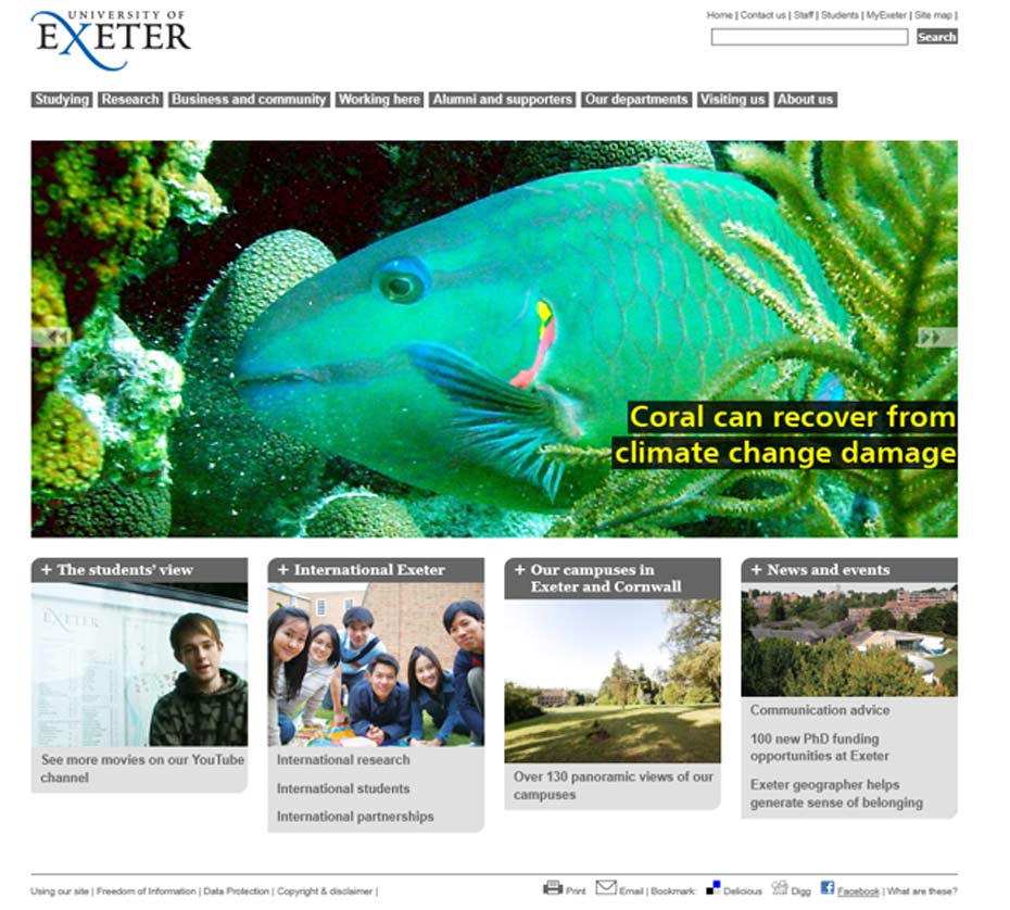
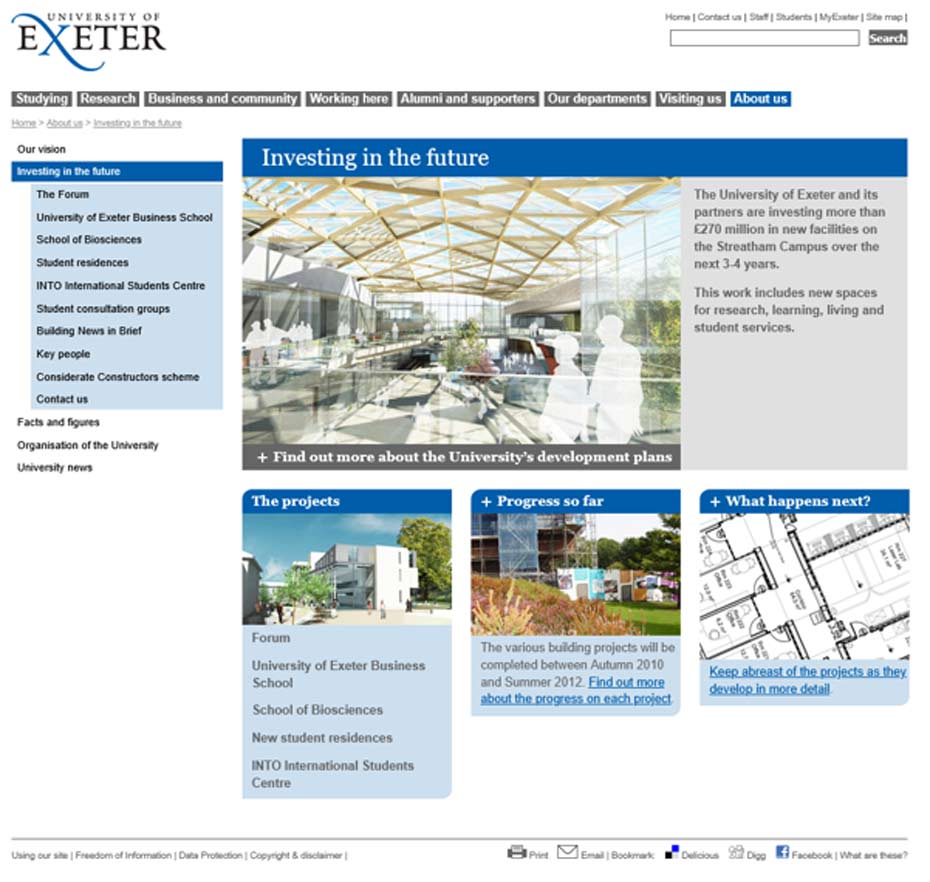
Second-level pages followed a similar layout to the homepage, with four feature boxes and a billboard. Third-level pages had a more simplified structure with a left hand navigation.
The introduction of a content management system (CMS) at the University brought significant improvements in how we managed and maintained our web presence. With TerminalFour (T4), we gained greater control over page structure, user permissions, and publishing workflows. We could easily set up users, restrict access to specific areas or functionality, and automate the publishing process - making it far more reliable than before.
At the time, publishing updates to the website could be a slow process. To improve efficiency - especially when dealing with embargoed content - I separated the billboard and news content from the homepage and placed them in dedicated sections. These were then included on the homepage using Server Side Includes (SSI), allowing us to update just those components without republishing the entire page.
2011
We began by building the central University pages within T4, then gradually migrated academic schools into the system. This involved configuring server domains and access rights for each area. Our publishing cycle was structured to accommodate the scale of the site: the main exeter.ac.uk domain published every hour, while college domains published every six hours.
This shift introduced a delay in seeing updates live, which was a change for users accustomed to immediate publishing. However, one major benefit was the ability to schedule content to go live at specific times - particularly useful for embargoed news stories.
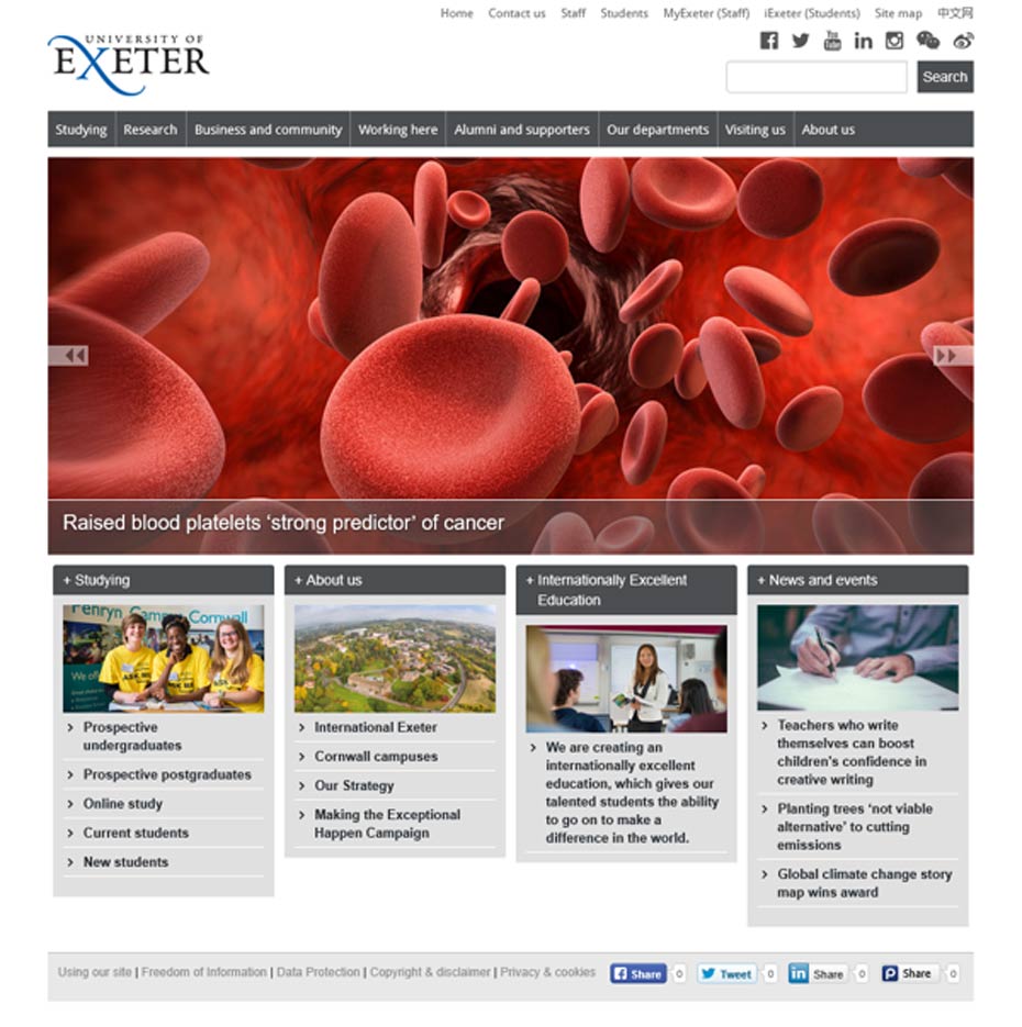
In November 2011, we welcomed a new Web Designer to the team, who introduced improvements to the templates and refined the colour palettes across the site. This design remained in place for several years, but in April 2017 we made subtle enhancements to the global navigation and feature boxes. One key improvement was integrating billboard text directly into the T4 templates, eliminating the need to use Photoshop to overlay text on images - streamlining the content creation process significantly.
2014
Between 2008 and 2014, as our use of TerminalFour (T4) expanded, we accumulated hundreds of page layouts and navigation objects across subsites. This growing complexity began to impact T4’s performance, especially when building new functionality in heavily populated areas of the site.
To address this, a colleague in the team explored the use of programmable layouts, which significantly streamlined our development process. This innovation allowed us to build new responsive websites anywhere within the site structure without manually duplicating navigation levels or page layouts. It greatly improved efficiency and maintainability, enabling us to scale the University’s web presence more effectively.
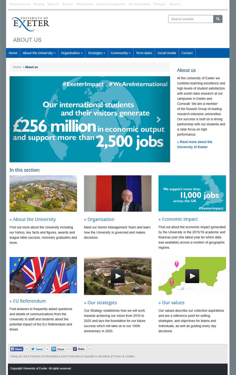
By implementing the new design across our website using TerminalFour (T4), we gained greater control over content management. During a review of T4-approved sections, we identified that the site had grown to over 50,000 individual web pages and over 1,000 devolved users.
2019
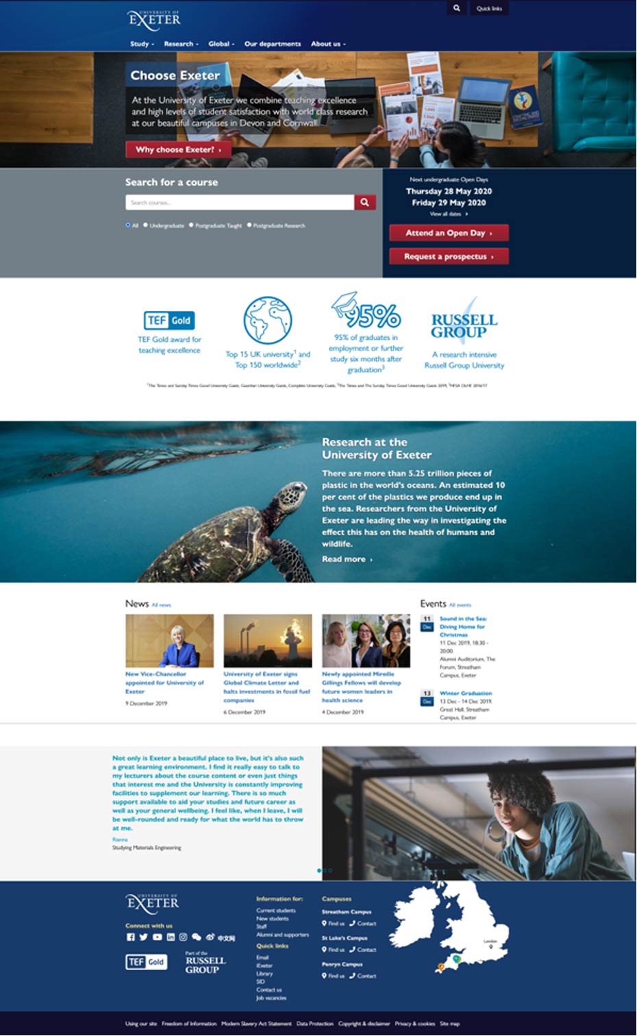
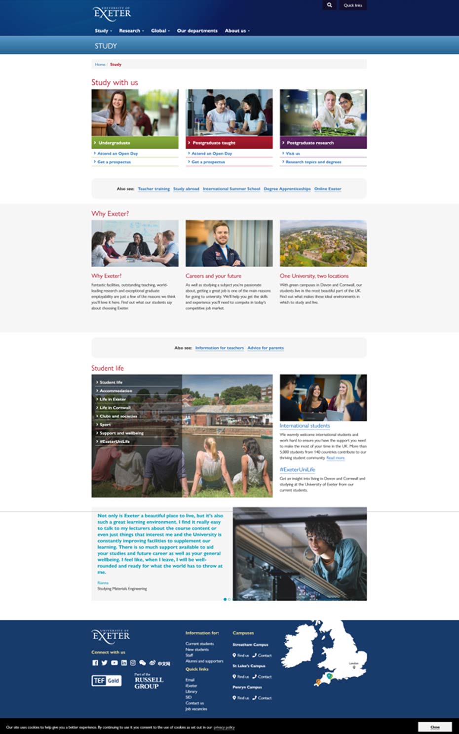
In December 2019, we launched a redesigned homepage, a new Study gateway page, and a refreshed Undergraduate Study site. These updates introduced a new global navigation header, featuring hover-over menus for key areas such as Study, Research, Global, Our Departments, and About Us. Each hover revealed a mega menu with structured links, improving user access to important content.
The footer was also updated to include essential links, and we incorporated a GDPR-compliant cookie policy. This explained to users what cookies were used, why they were necessary, and how they were managed - ensuring transparency and legal compliance. To ensure consistency and ease of maintenance across the site, we implemented the global header and footer as PHP server side include files. This allowed all pages to link to these shared components, meaning any updates made to the header or footer would be reflected instantly across the entire website. This approach significantly streamlined site-wide changes and reinforced a unified user experience.
Around this time, the Web Team also began working with AB Tasty, a third-party split testing provider. This platform allowed us to direct live traffic to alternative versions of pages and measure how they performed with real users. The software tracks clicks on page elements, scroll depth, time on page, revisit rate, bounce rate, and subsequent page views, providing detailed data to assess performance against the original versions.
For example, the redesigned homepage saw a 74% increase in traffic to the Undergraduate Open Day page, a 140% increase to the Undergraduate Prospectus page, and a 97% increase to the Undergraduate homepage. Armed with this data, we were able to demonstrate that the redesigned homepage outperformed the original, giving us the confidence to make it live knowing it would improve the user journey to key areas of the site.
The rollout of programmable layouts marked a new era in our web development approach. Building on our earlier responsive layouts, these new designs allowed users to scroll down the page with the left-hand navigation dynamically following the scroll - enhancing usability and accessibility.
Following the outbreak of the COVID-19 pandemic in 2020, we initiated a Website Resilience Project. This was driven by analysis of historic incident and problem records affecting website uptime over the previous eight months. Early in the project, we decided to sync the University homepage, the Coronavirus site, and Clearing pages from our on-premises infrastructure to the cloud. This involved configuring CDN behaviours to mirror and serve content from the cloud, significantly improving resilience.
We evaluated three scenarios for cloud migration:
- Scenario 1: Migrate key areas (Home, UG, PGT, Study Gateway) to T4 v8 in the cloud.
- Scenario 2: Migrate the entire site to T4 v8 in the cloud.
- Scenario 3: Migrate everything to T4 v7 in the cloud, then upgrade to v8 later.
We opted for a phased approach based on Scenario 1, followed by a comprehensive audit to determine further migration priorities. The project proved more complex than anticipated, with around 25,000 live pages in T4 v7. Many pages were reviewed and retired, while departmental sites were excluded from migration, as they were slated for future rebuilds using new layouts.
I began building programmable layouts, formatters, and navigation objects in T4 v8 - essentially starting from a blank canvas. The development and testing process took several months.
In February 2022, a new IT Project Manager was appointed to guide the project. The Project Board prioritised critical journey sites, and the Web Team ran a series of sprints to build the Undergraduate Study and Postgraduate Taught sites, followed by additional Study Gateway sites. These were manually constructed in T4 v8, with careful planning around CDN behaviours to ensure correct URL routing to the cloud.
We encountered challenges integrating database-driven content, which initially required hardcoding links to on-prem servers. These were flagged for future resolution.
2022
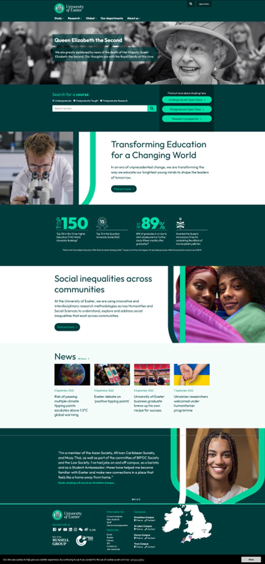
In September 2022, we launched a new homepage and updated other areas of the site to reflect the University’s refreshed branding - including a new logo and a green-themed design.
In March 2023, I built the University homepage in T4 v8. This was a technically challenging task, as the homepage sat at the top of the site structure and we needed only that page - without its subsections - to go live. With support from T4’s technical team, we successfully deployed the change during an out-of-hours window.
Later in 2023, the migration project gained momentum. We held a series of project management meetings with T4 to initiate the migration sprint. I compiled a list of URLs for a one-off bulk migration, identifying which areas pulled in dynamic content from on-prem systems, used forms, or required Single Sign-On (SSO). Only sites using our first programmable layout were included; others would be rebuilt directly in T4 v8 using newer layouts and CDN behaviours. Intranet sites were excluded and scheduled for eventual migration to SharePoint.
The migration involved approximately 7,000 pages, primarily within the www.exeter.ac.uk domain, with a few additional subsites. In early 2024, we worked closely with T4 to map template elements from T4 v7 to v8, overcoming numerous technical challenges. A content freeze was imposed, and all users were temporarily locked out of T4 v7. Updates were logged and applied post-migration.
Each section was manually reviewed by the team to ensure content accuracy and functionality. Once verified, we worked with T4 to activate the pages in T4 v8 using CDN behaviours - for example, routing all traffic from www.exeter.ac.uk/about to the cloud. SSO was applied to secure areas as needed.
We then created user accounts for T4 v8, restructured moderator access for better governance, and updated training materials - including new web accessibility training for all users.
2025
In 2025, we began a clean-up operation in preparation for the on-prem server switch-off. This included identifying dynamic areas to be migrated to a new Codebox server. As of now, T4 v8 hosts around 10,800 live pages, with a target to reduce this below 10,000 for better manageability. We’re also actively working on SEO improvements and enhancing the overall user experience.
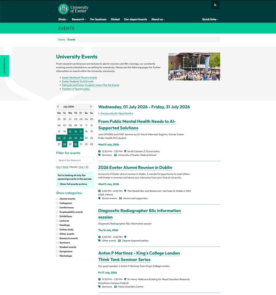
Changes to the website now publish out every 30 minutes and I started work in September 2025 to look at a new events system to replace our old events system after 16 years service and 15,000 events. We now have a central events system built within T4 which is controlled by tagging events to different areas which was launched in March 2026.