
‘Retina displays’ have a higher pixel density so that individual pixels aren’t visible to the naked eye.
Working with images
Technical specifications for images
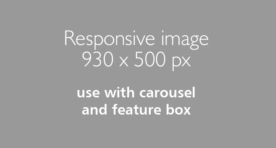
The ‘standard’ image size for University responsive templates is 930 x 500 pixels.
Use with:
- Carousel (single or multiple images)
- Feature box
- Highlight content panel (optional)
Why such a large image size of 930x500?
The reason for this is to accommodate ultra-high resolution displays which are becoming more common, especially in mobile devices. ‘Retina displays’ have a higher pixel density and the ability to display text and images very crisply, so that individual pixels aren’t visible to the naked eye.
Image in quote box in left column
‘Retina displays’ have a higher pixel density and the ability to display text and images very crisply, so that individual pixels aren’t visible to the naked eye.
Recommended image sizes for all templates
| Template | Recommended image size (px) | Notes |
|---|---|---|
| Carousel | 930x500 | Standard responsive image size |
| Feature box | 930x500 | Half size 465x250 or width/hight ratio of 1.86 will work if full responsive image is not available |
| Acc: www page | Don't use | Do not embed images as anything above mobile width will be distorted. Use a carousel or highlight content panel. |
| Tabs | Don't use | Do not embed images, use highlight content panel |
| Profile gallery | 465x465 |
Square image |
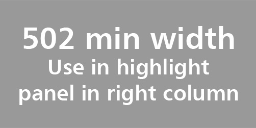
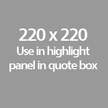
| Highlight content panelUsed in a quote box Used in left col Used in right col Used in tab |
440 min width 502 min width 376 min width |
220 min width can be used 251 min width can be used 188 min width can be used |
It's important to consider how images affect page load times.
- It is common for more than half of the page load time to be taken up downloading images.
- Page abandonment rates are directly linked to page load times. 25% of users will give up if a page takes more than just 4 seconds to load.
- Google will penalise (in search rankings) websites that take an excessive amount of time to load.
- Images should be optimised to reduce file size before adding to the media library.
- Carousels should be limited to no more than 4 or 5 images in order to reduce page load times.
Responsive web pages will display differently depending on the platform that they are being viewed on. The change in size and context of an image can make a difference to the way a user interprets the page.
- The responsive templates require the same image to be used in different sizes across different platforms.
- Try to choose images that scale well and still have the same meaning when on a small mobile screen.
- Avoid images that don't scale well, where important fine detail is lost or dramatic impact is reduced.
- Wherever possible, test new images across multiple platforms.
- 'Standard' 930x500 images tend to work better with photos that were taken with landscape orientation. Portrait photos can be cropped to this size, but don't always work well in this aspect ratio.
Use a highlight content panel to add images to tabs.
Lorem ipsum dolor sit amet, consectetur adipiscing elit. Vivamus tempor ultrices est, eget semper ante. Nunc in velit pretium nisl rutrum venenatis. Sed venenatis vitae turpis nec venenatis. Phasellus varius, sem tincidunt dapibus vulputate, erat dolor imperdiet lacus, vitae egestas sem est nec magna. Mauris sed consequat odio. Cras nunc ex, tristique quis urna ac, condimentum tincidunt ipsum. Cras sodales cursus erat. Nunc a velit ac leo sodales lacinia id at enim. Integer consequat porta justo, non ultrices dolor. Donec viverra felis id ex posuere eleifend. Vivamus porttitor, libero quis accumsan ornare, magna massa cursus purus, vel vulputate ante odio eget tortor. Nulla ac laoreet erat. Nulla commodo ipsum luctus efficitur efficitur. Nunc ullamcorper ipsum lectus, at elementum massa accumsan vel. Curabitur laoreet quam in elit maximus euismod.